OvervIew
The Brief
WGU Labs began as a small team, creating research-based learning modules. From the outset, WGU Labs had little in the way of a defined visual identity. I was hired on as an illustrator to create visuals and motion graphics for the learning modules, and as WGU Labs evolved its focus into innovation and investment, I had the opportunity to create an ever-widening diversity of multimedia assets. WGU Labs' work gained traction and prestige, and with that came the need for a touchstone brand identity. Not a rebrand, but a refresh to focus and clarify the company’s voice. I led this undertaking from concept to organization-wide adoption and implementation.
Phase I
Initial Concepts
It was important to my team that the evolution of the brand was not so jarring as to confuse partners and press. To that end, I selected a few elements that had been generally consistent over the years — the WGU Labs logo (designed by Luis Ramirez), two shades of blue, and a couple fonts — and created three different concepts to explore potential directions to take our visual identity.
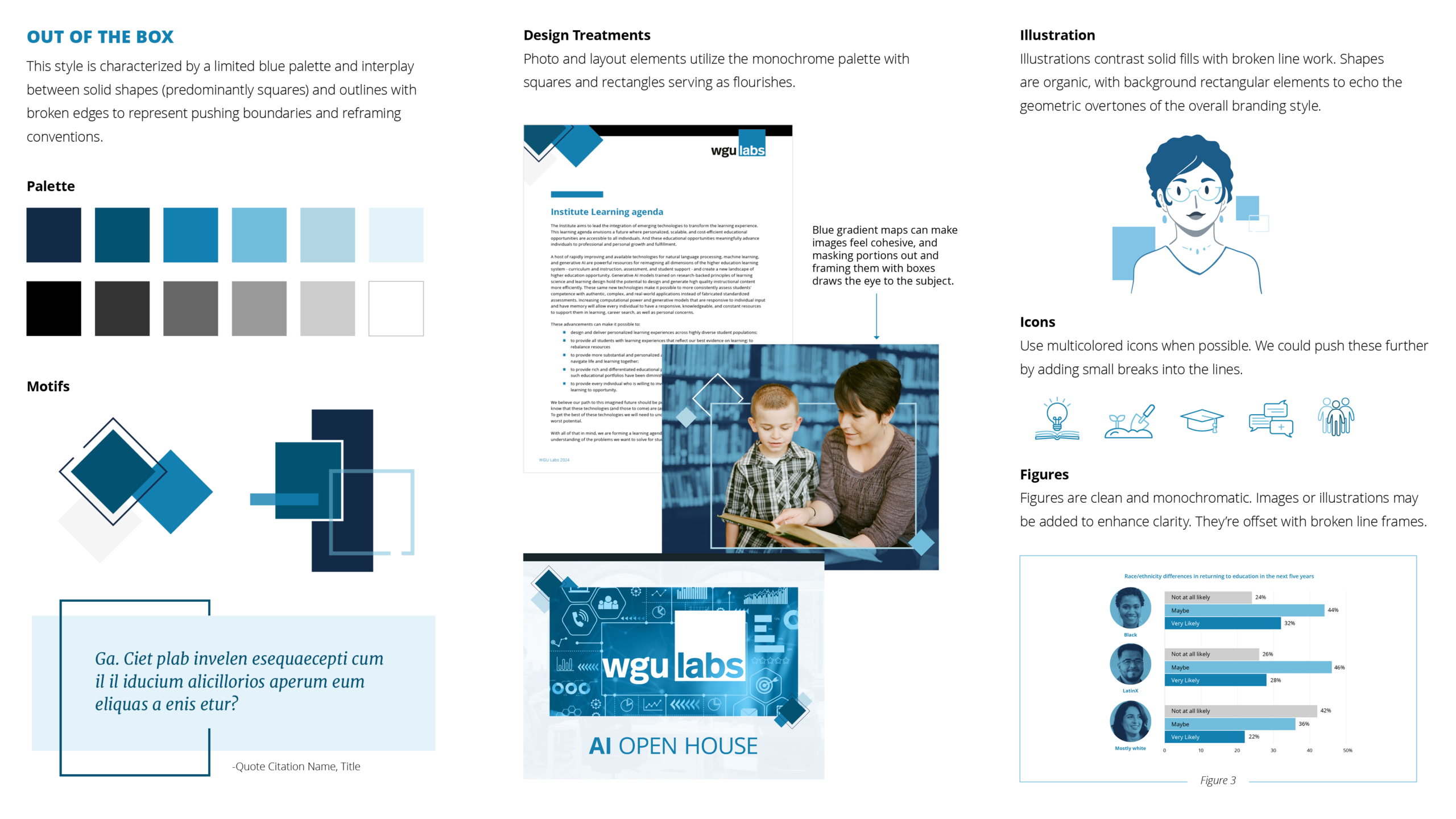
Concept 1: "Out of the Box." This style is characterized by a limited blue palette and interplay between solid shapes (predominantly squares) and outlines with broken edges to represent pushing boundaries and reframing conventions.
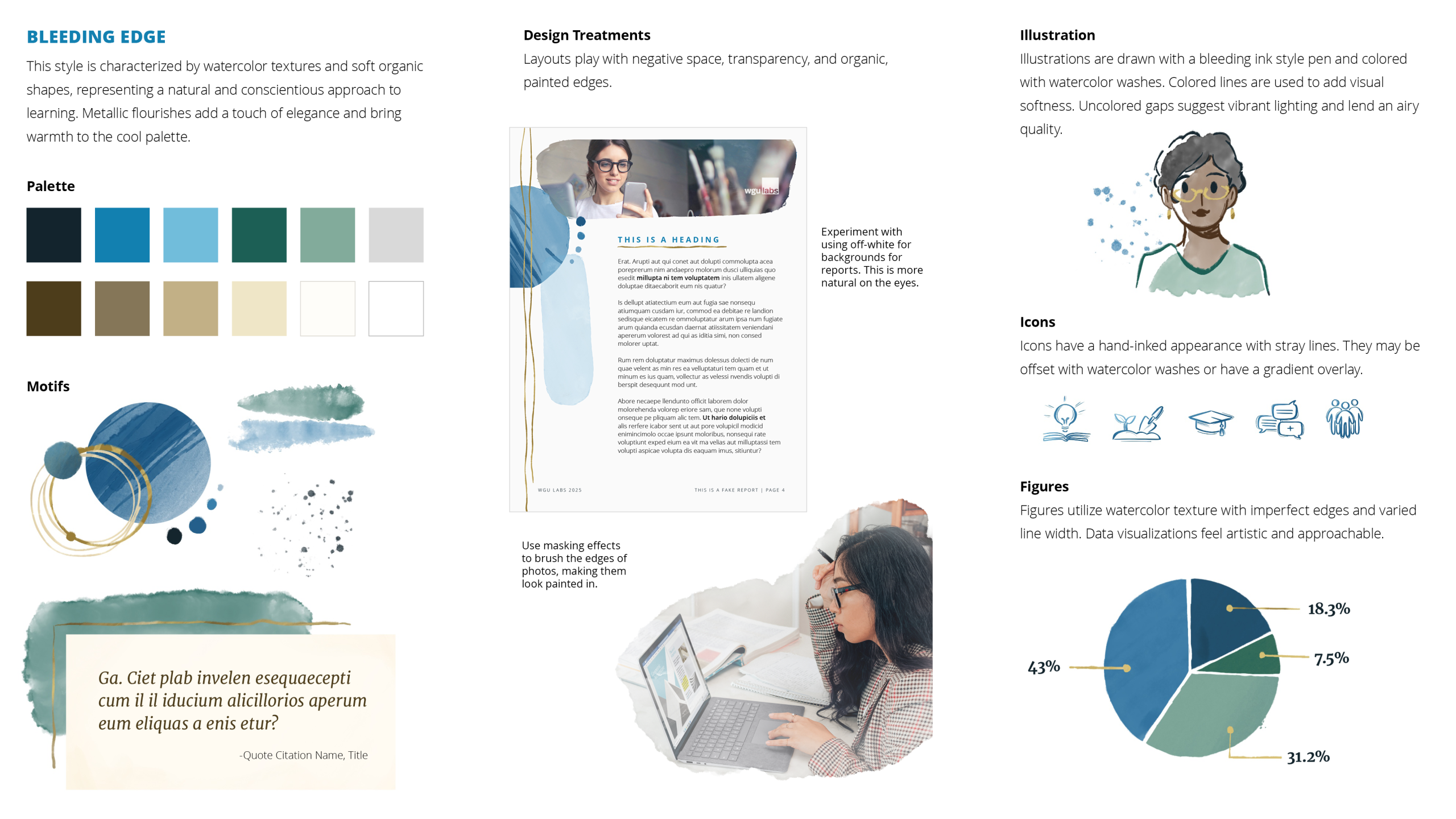
Concept 2: "Bleeding Edge." This style is characterized by watercolor textures and soft organic shapes, representing a natural and conscientious approach to learning. Metallic flourishes add a touch of elegance and bring warmth to the cool palette.
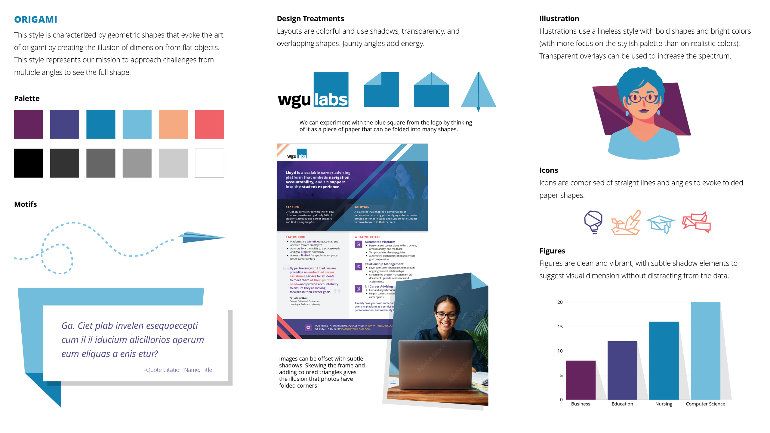
Concept 3: "Origami." This style is characterized by geometric shapes that evoke the art of origami by creating the illusion of dimension from flat objects. This style represents our mission to approach challenges from multiple angles to see the full shape.
Phase II
Feedback and Iteration
I met with my Marketing and Communications team to pitch the three different concepts and took careful note of their reactions and insights. All three concepts were well received, with concept 2 emerging as a clear favorite. I synthesized our discussion below.
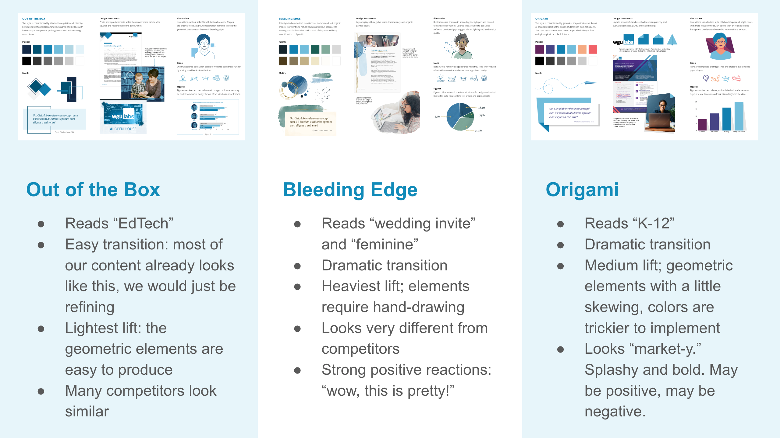
Notes on the three different pitches, weighing their pros and cons.
Much as my team and I loved concept 2, we recognized that the tone wasn't quite right for an EdTech organization, and it would require the heaviest lift to implement, which would make it harder for the rest of the team to adopt.
We decided to try combining the visual language of concepts 1 and 2 by implementing the geometric motifs from “Out of the Box” (which read "EdTech") with the watercolor treatments from “Bleeding Edge” (which offered a soft, human-focused energy).
About this time, we also received helpful feedback from an audit performed on the WGU Labs website, which recommended incorporating a strong contrasting color to our palette for Call to Action buttons.
Armed with these valuable directions, I created "Bleeding Edge v2.0."
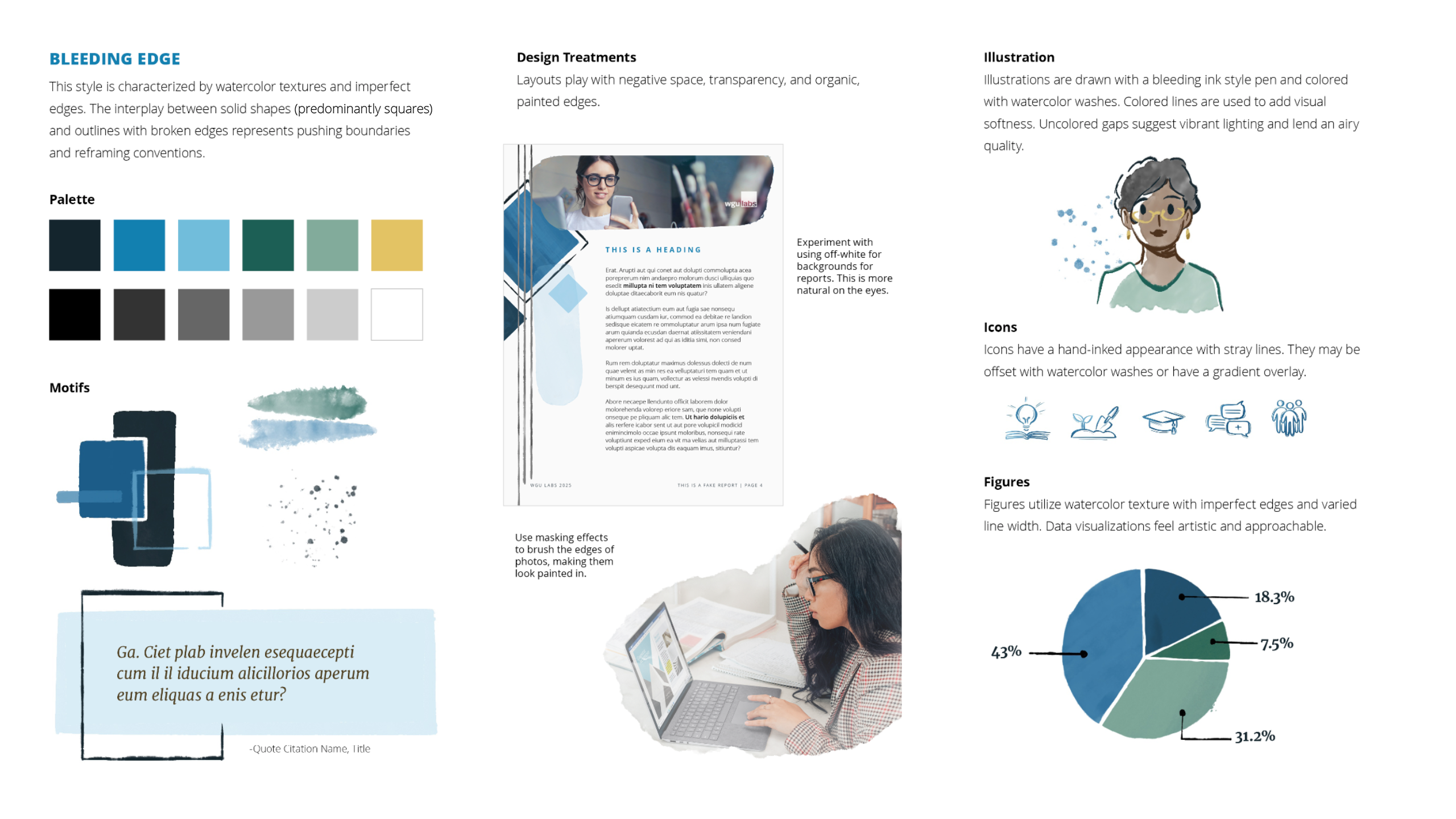
Bleeding Edge v2.0.This style is characterized by watercolor textures and imperfect edges. The interplay between solid shapes (predominantly squares) and outlines with broken edges represents pushing boundaries and reframing conventions.
Phase III
Refining
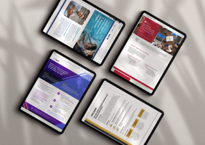
With an overarching concept in place, it was time to start testing implementation across our different media. I mocked up a landing page, letterhead, a few briefs, and a couple spreads for research reports using existing content. This was a crucial step, as it allowed me to see where certain elements worked and where they didn't with actual context, beyond the snapshots I'd cobbled together for the moodboards.
For instance, I quickly found that the greens had a muddying effect that didn't lend well to our message. The painterly approach to graphs made the data harder to interpret; crisp geometric figures were both easier to produce at scale and more accurate. I cut what didn't work and sharpened what did, strategically developing the guidelines for how various elements would be styled.
I presented the work-in-progress to my directors, along with the design philosophy unifying the entire concept. With their enthusiastic approval, it was time to codify the design language and implement the new look across WGU Labs publications.
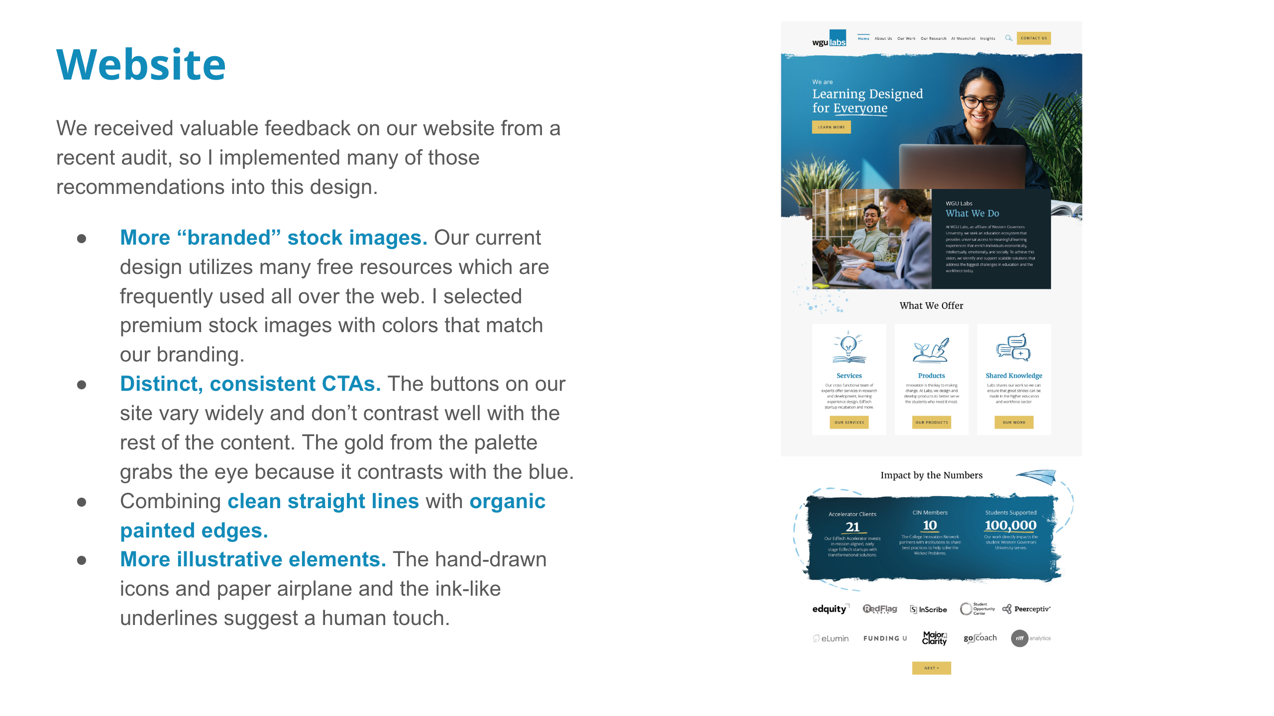
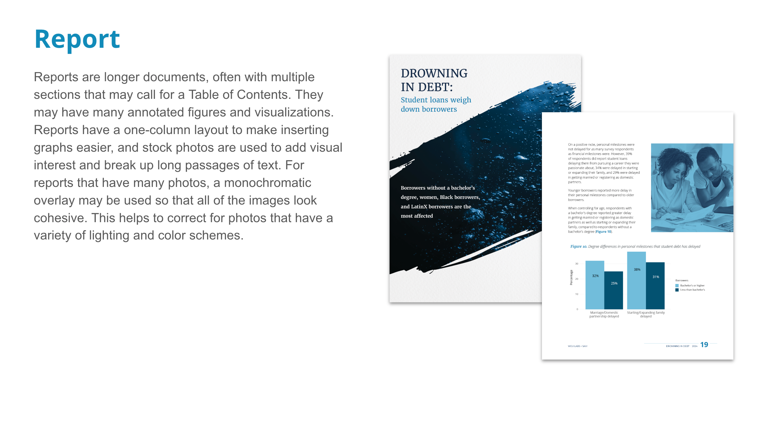
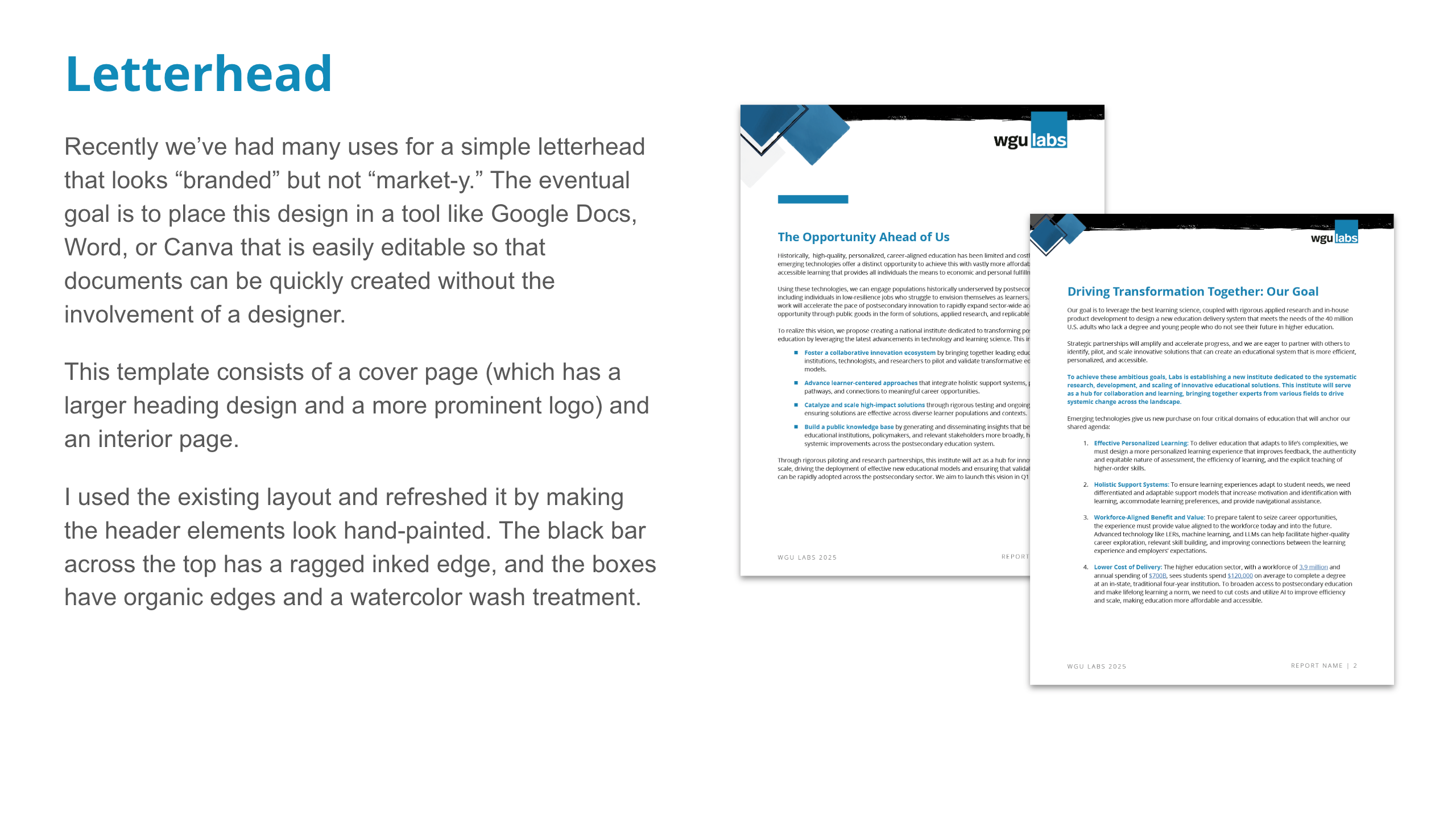
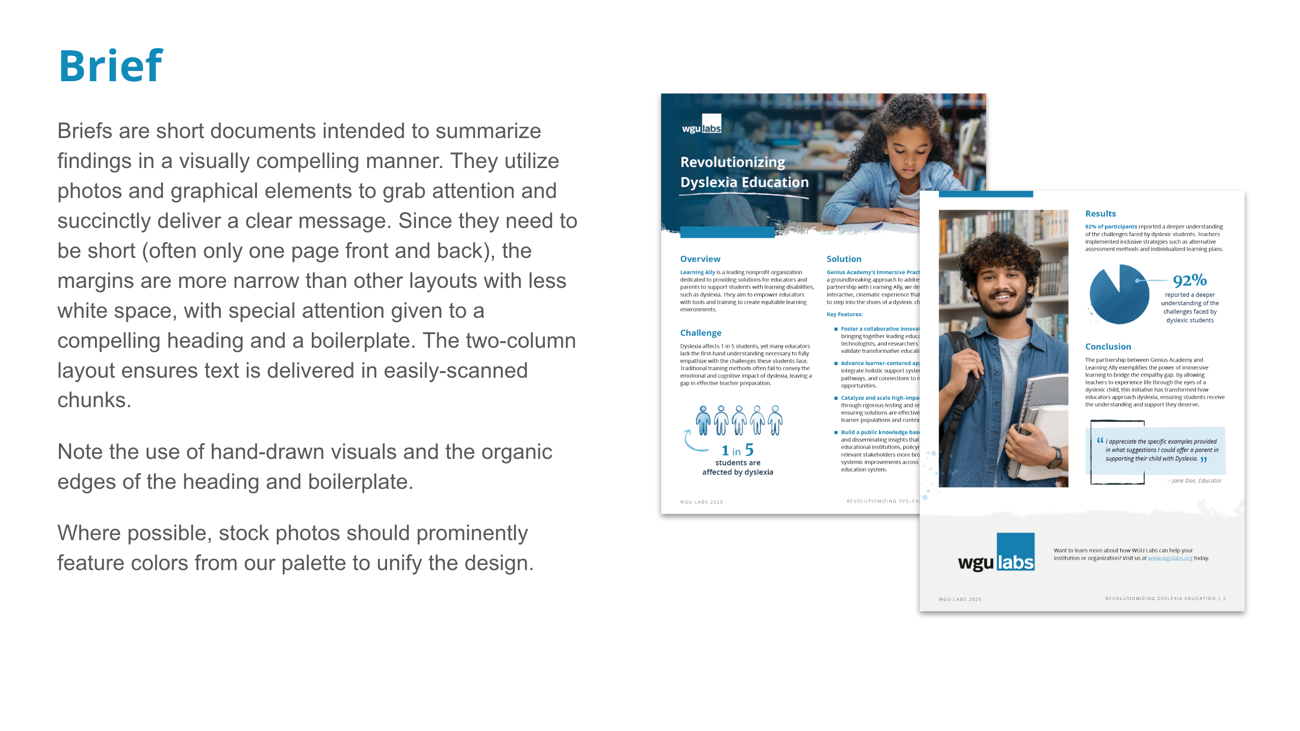
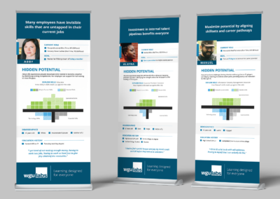
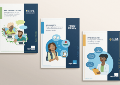
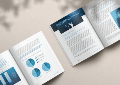
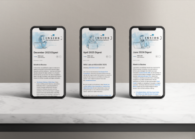
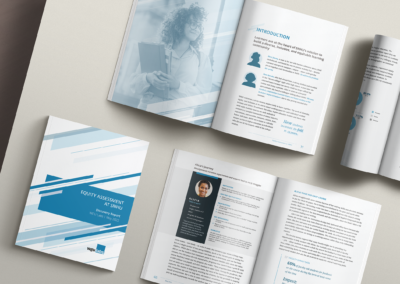
A series of mockups to test the brand implementation across different media.
Phase IV
Launch and Implementation
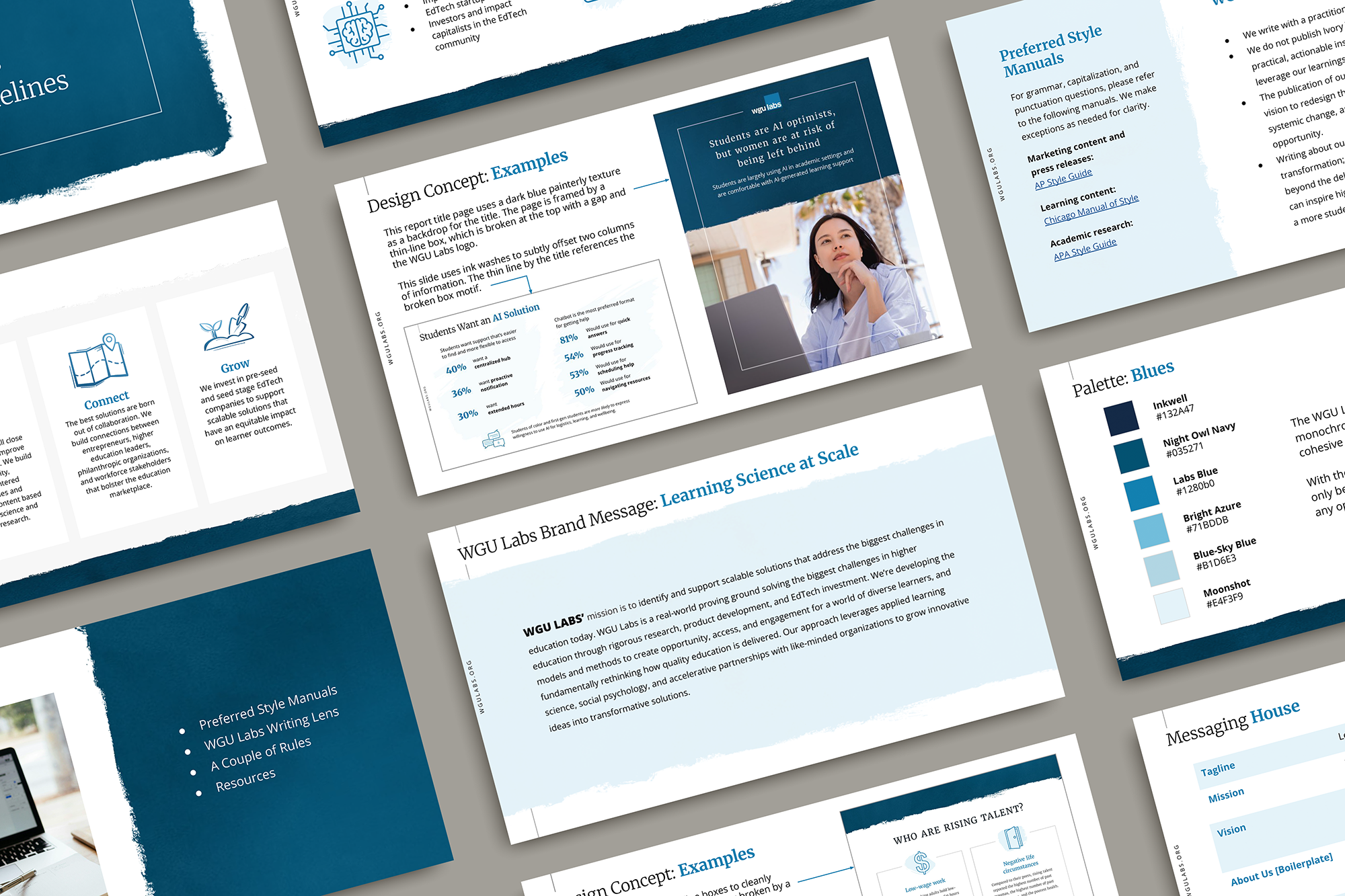
After building a robust repository of assets and templates, I created a comprehensive branding guide in Google Slides to make it easy to access and update. I worked with WGU Labs' contracted front end developer Zaryn Ficklin to modernize our website, and otherwise updated all other publications myself. Furthermore, I ensured that resources were readily available and easy for coworkers without design expertise to use for projects going forward. I created tutorials and hosted workshops to acquaint users with the assets I'd built, and addressed friction points as they emerged.
The result was a beautiful, coherent brand system with a single source of truth. This became immediately valuable as the work of WGU Labs accelerated in social media posting, high-visibility engagements, and product development, all of which needed a clear, unifying identity.
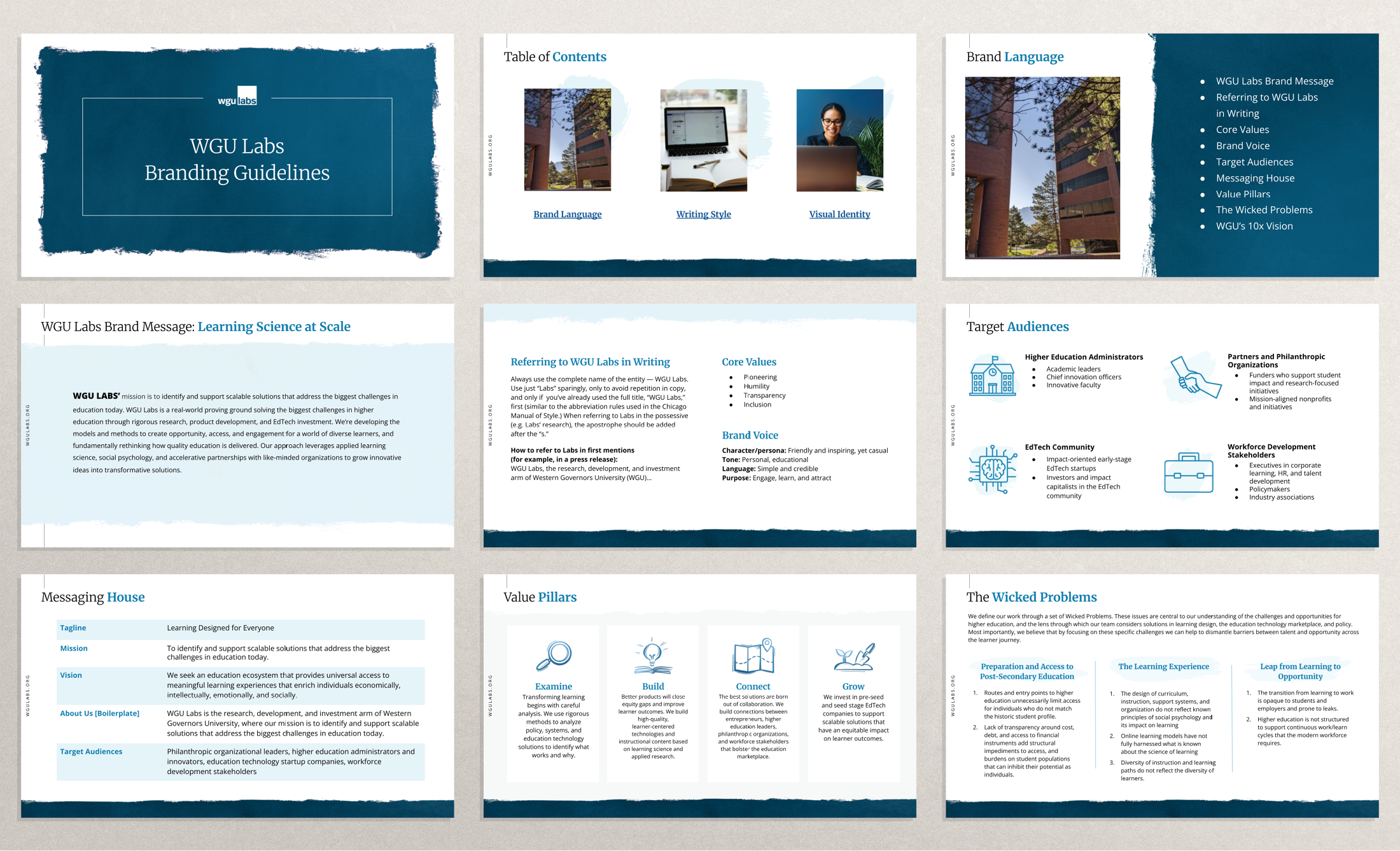
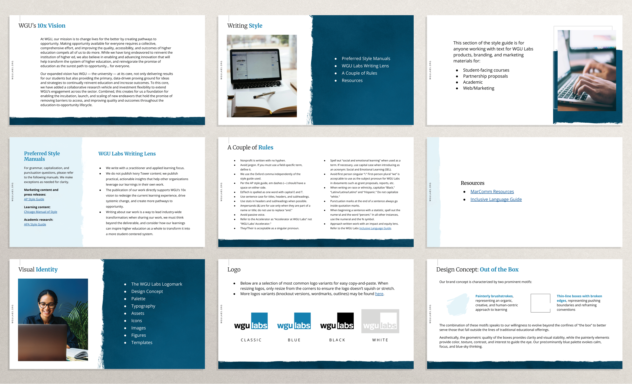
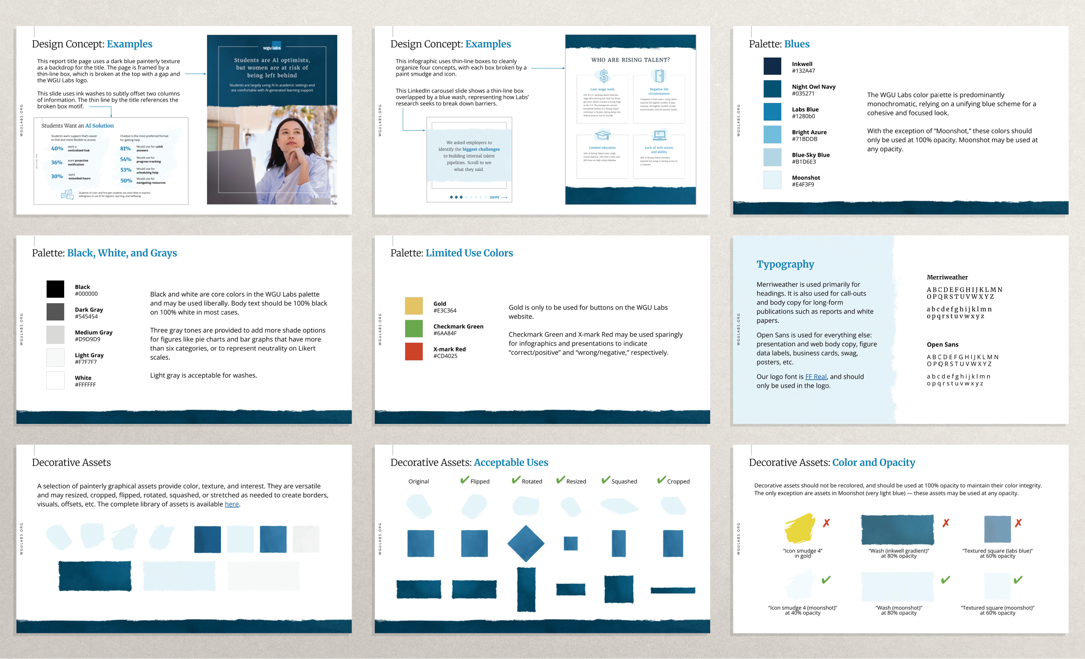
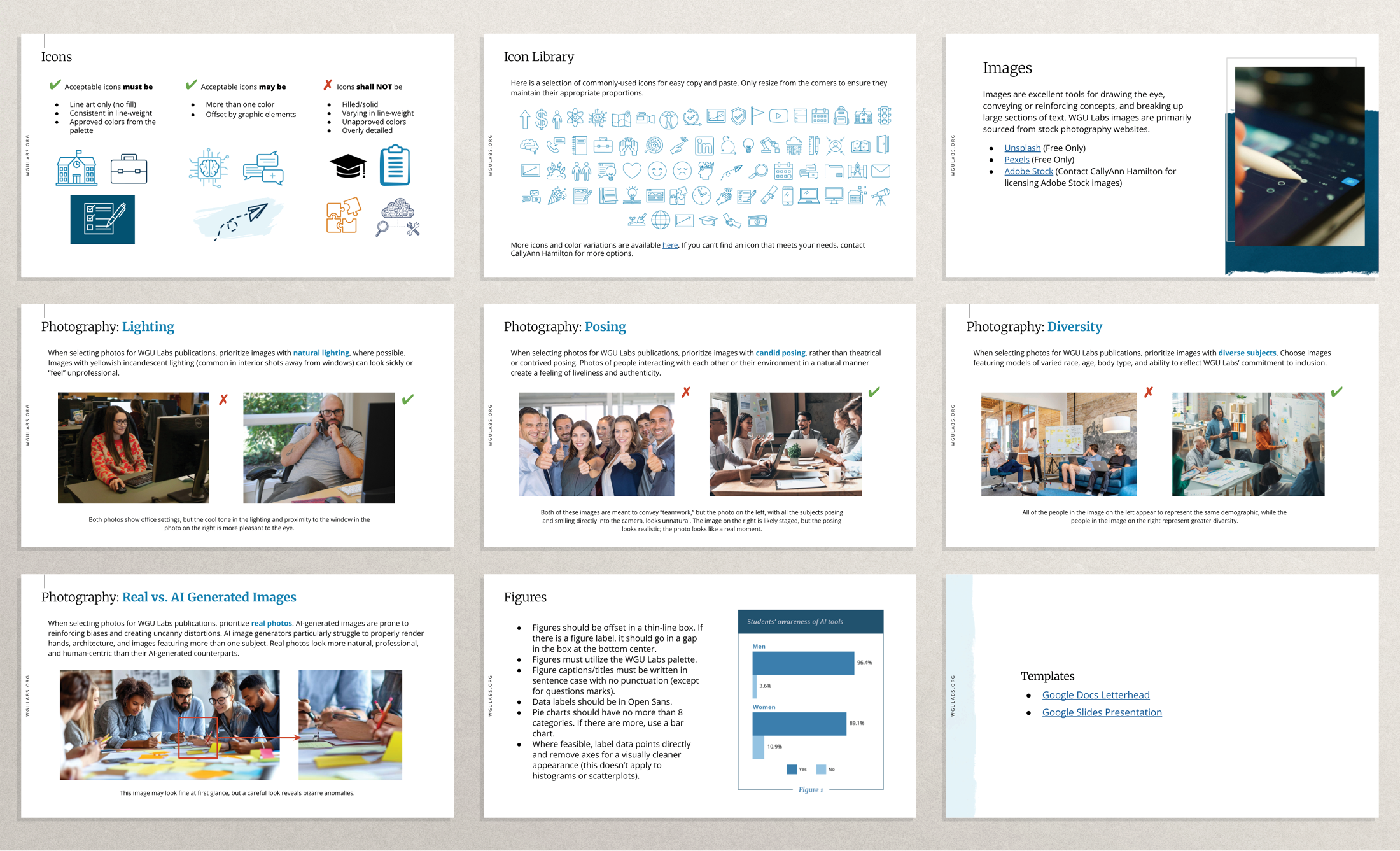
The comprehensive brand guide detailing brand language, writing style, and visual identity. The guide includes the design philosophy, example treatments, the logo lockup, the palette, typography, directions for applying assets, icons, stock photo usage guidelines, data visualization styles, and links to assets and templates. I built this deck using the template I designed with the refreshed brand.
The text in the brand language and writing style sections was provided by WGU Labs Content Marketing Manager Holly Wallace.
The Building Blocks
Brand Elements
Color Palette
Typography
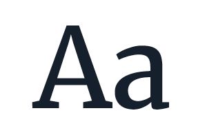
[Headings]
Merriweather (Regular)
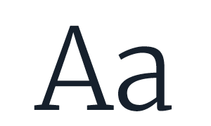
[Body Serif]
Merriweather (Light)
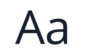
[Sans]
Open Sans (Regular)
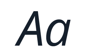
[Captions]
Open Sans (Italic)
Visual Motifs

Painterly brushstrokes, representing an organic, creative, and human-centric approach to learning

Thin-line boxes with broken edges, representing pushing boundaries and reframing conventions
In Application
The System in the World
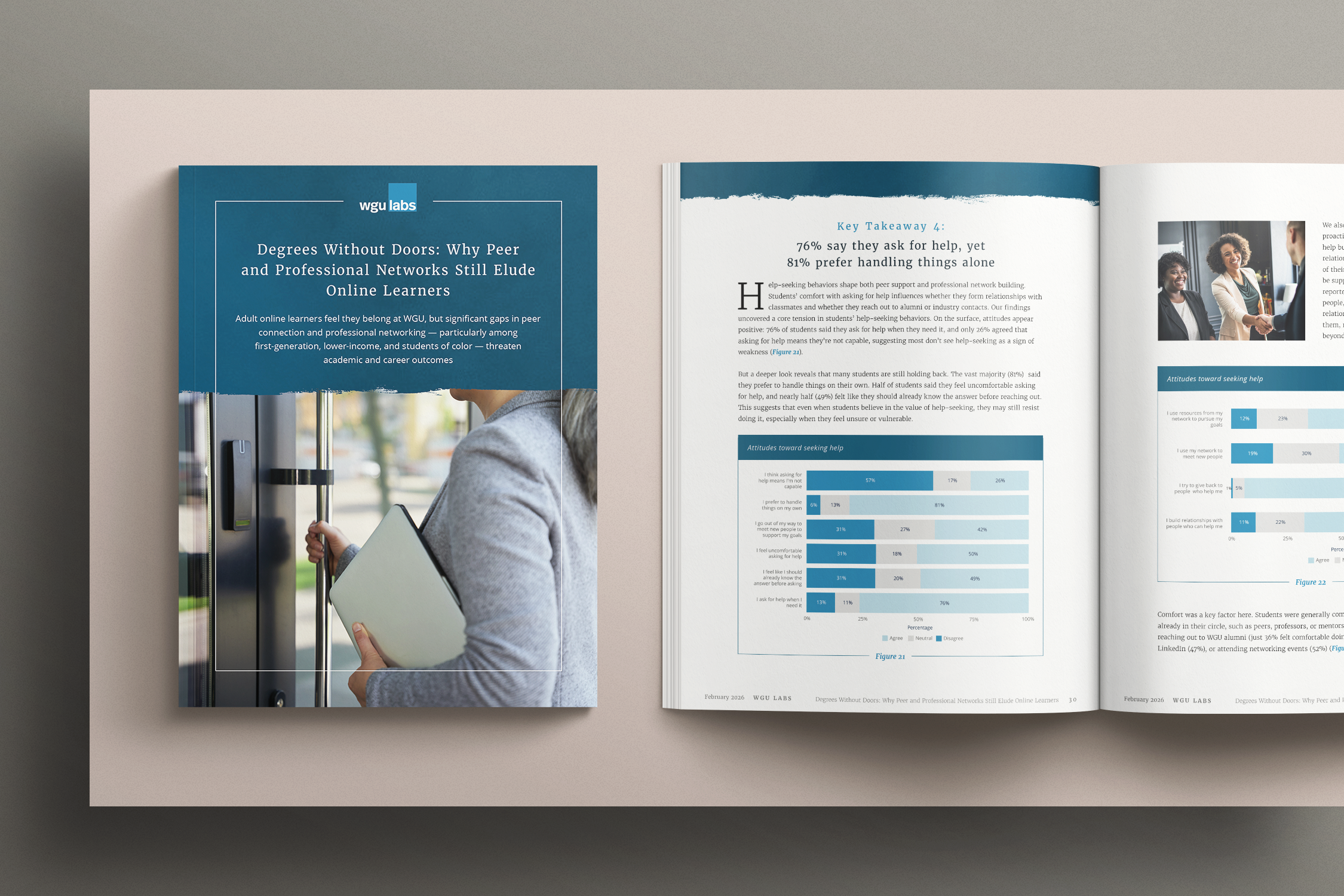
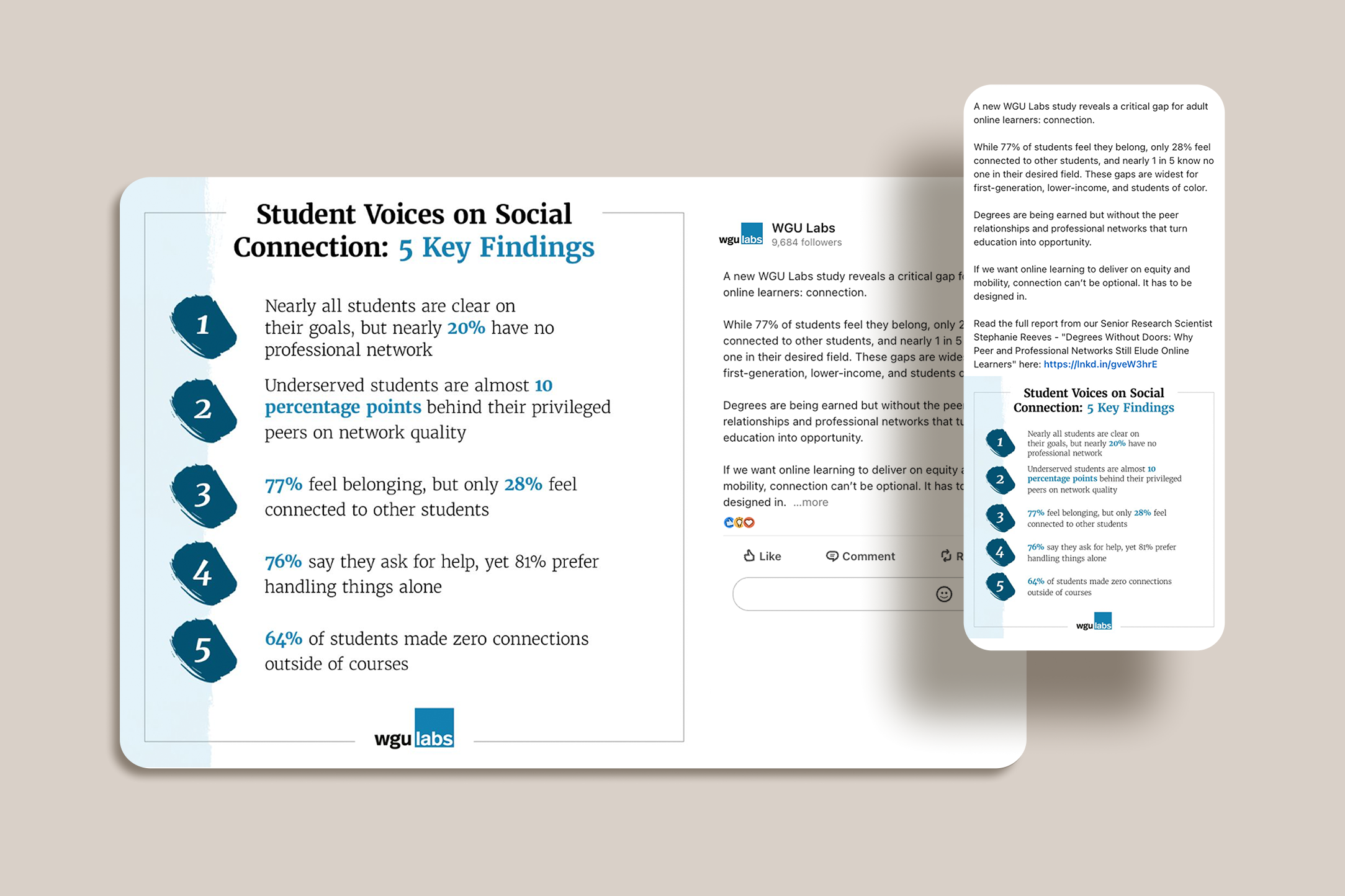
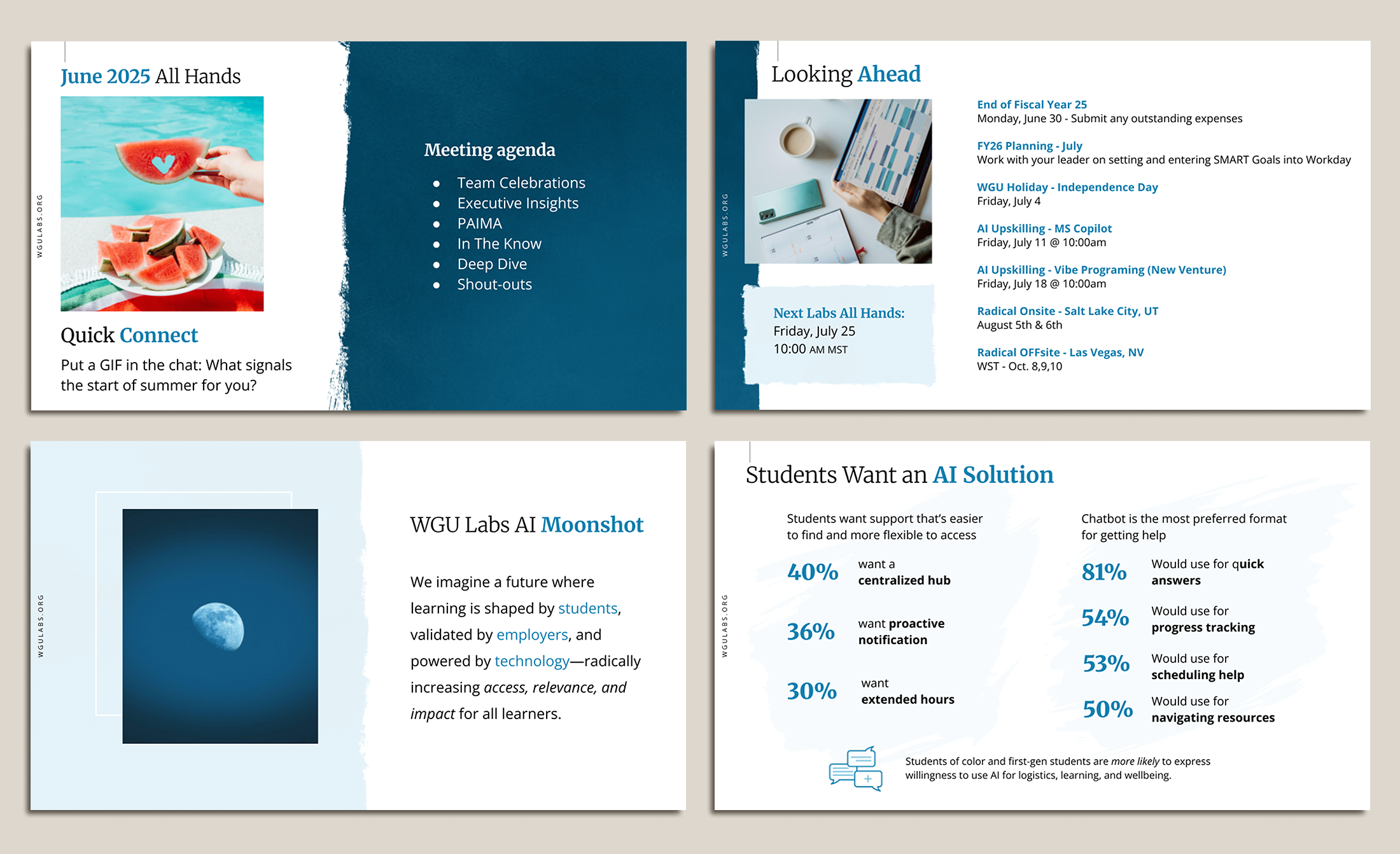
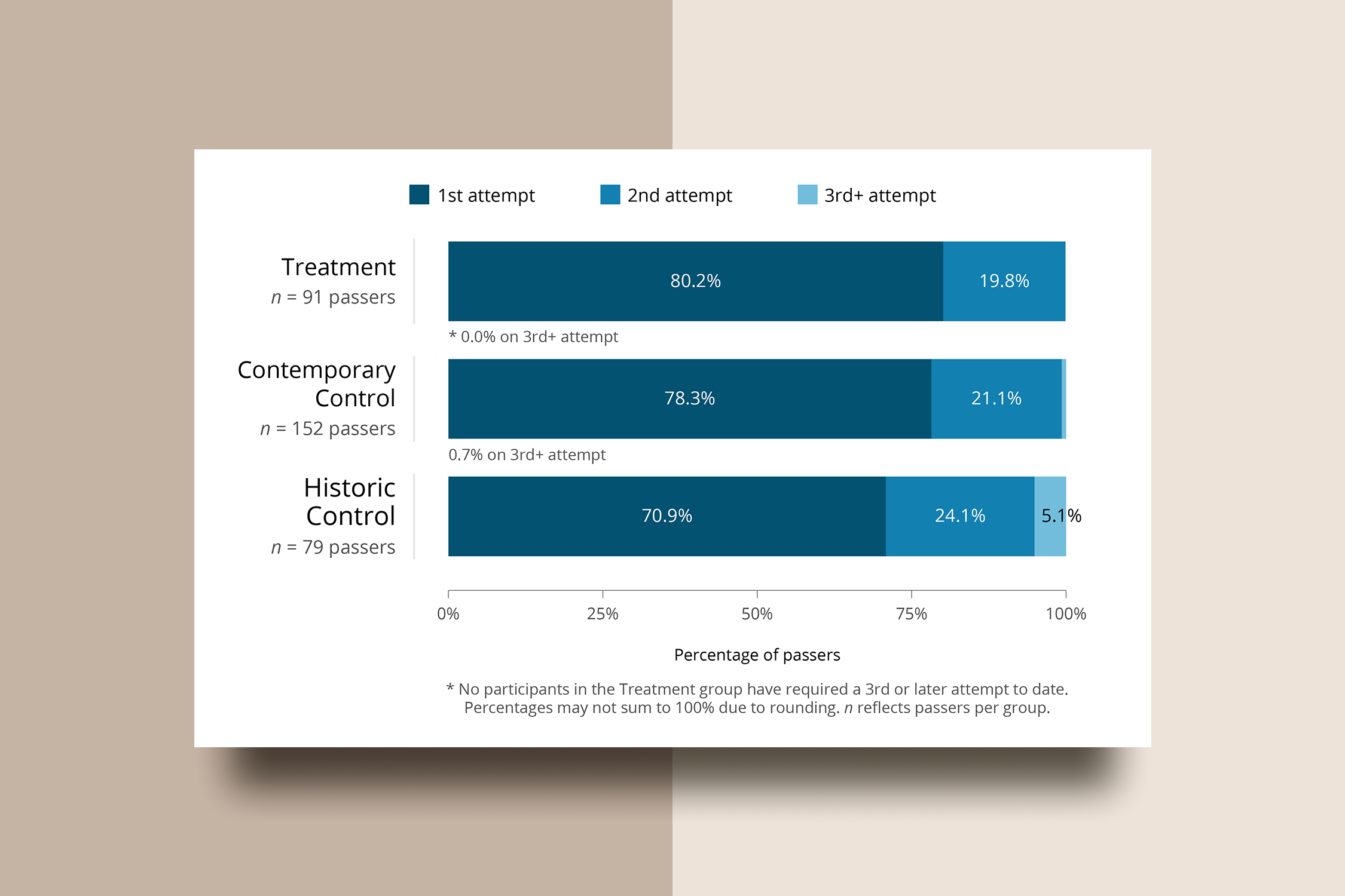
A research report, social media post, presentation slides, and data visualizations showcasing the WGU Labs brand.