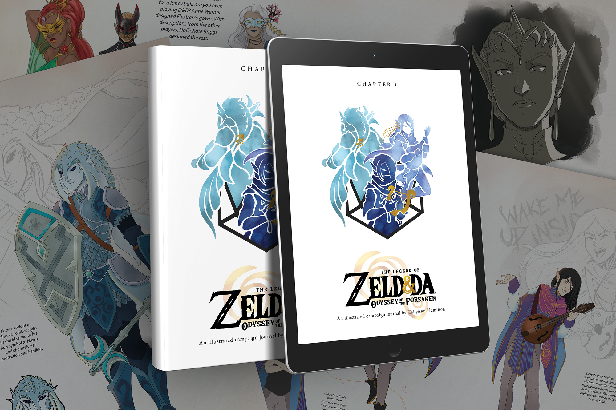
As a devoted fan of both The Legend of Zelda video games and Dungeons & Dragons, I set out to create a tabletop roleplaying game combining them, lovingly termed ZelD&Da. Over the campaign's many-year run, I created slews of illustrations of characters and scenes for myself and my players. I compiled the illustrations made by myself and other collaborators, and wrote up a condensed version of the first third of the campaign story into a 60-page, full color art book. I worked with a local printer to create a limited physical run of the book, which I offered for sale alongside other art at pop culture conventions.
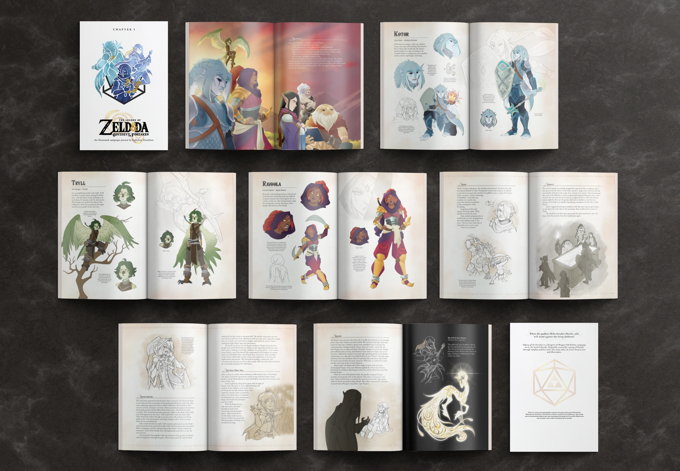
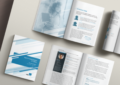
A selection of spreads from the print version of Odyssey of the Forsaken (Ch.1).
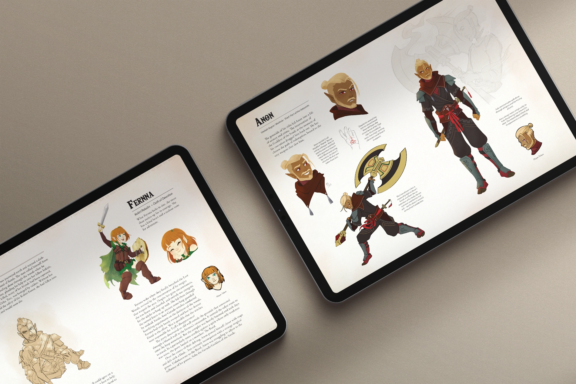
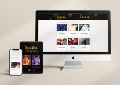
Two spreads from the digital version of Odyssey of the Forsaken (Ch.1).
Design Elements
Logo
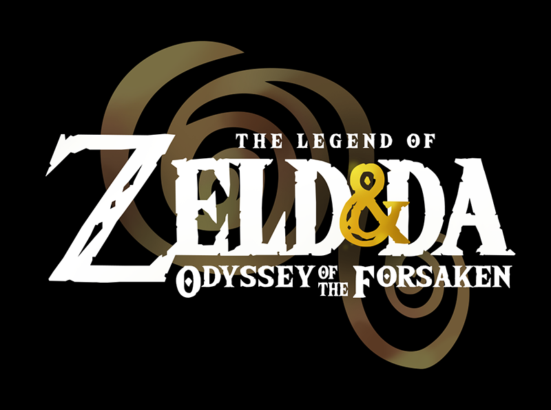
Dark Version
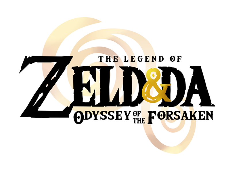
Light Version
Color Palette
Typography
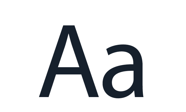
[Sans]
Myriad Pro
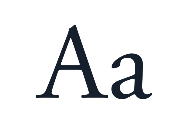
[Serif]
Adobe Garamond Pro
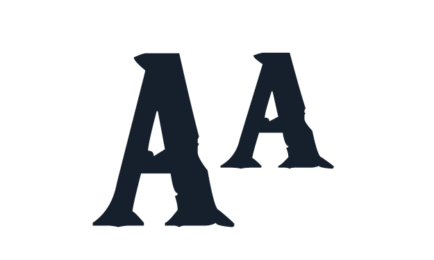
[Titles]
The Wild Breath of Zelda
Visual Motifs
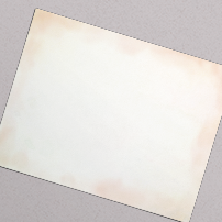
Parchment, a textured backdrop I painted to serve as the canvas upon which the majority of the spreads appear.
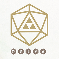
Geometric icons that reference elements of both Zelda and TTRPG. Triangles and hexagons represent the Triforce and polyhedral dice.
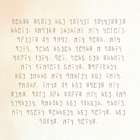
Ancient Hylian script borders many of the spreads. This subtle Easter egg contains a poem describing the lore of the game's pantheon.
Production
Character Design
The players described how they wanted their characters to look, and I drew up portraits of their adventurers. At first, the portraits were just grayscale headshots so we could get quickly into the game, but over time I expanded on their designs to include color. I eventually designed full view images of each character, including their outfits and special gear they’d collected. In addition to the player characters, I designed all of the supporting cast.
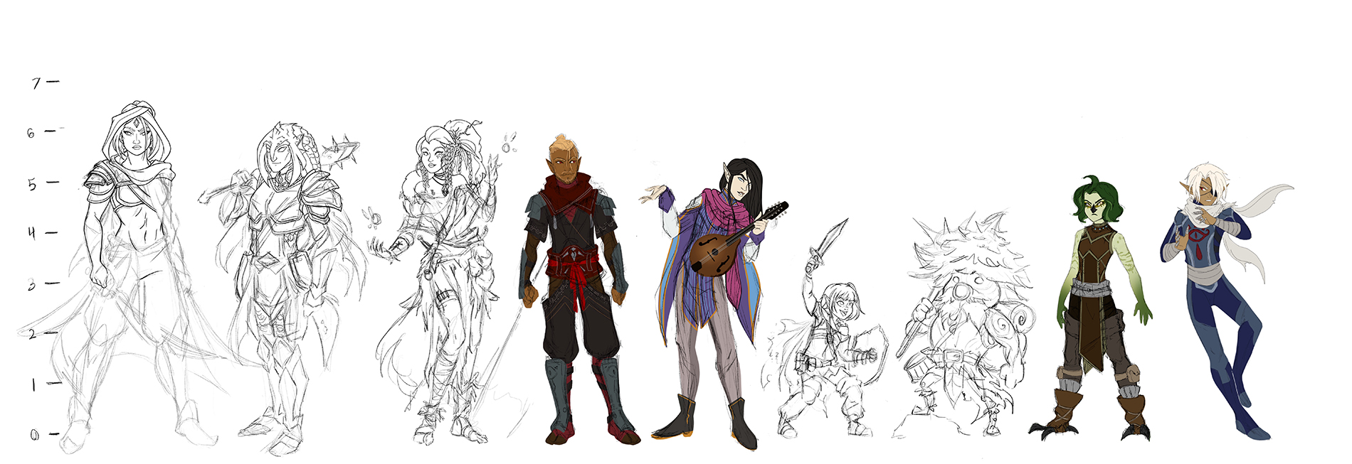
An in-progress lineup of most of the player characters and a few key NPCs, at various stages of completion. Having visuals for the characters helped me craft more immersive descriptions for the players.
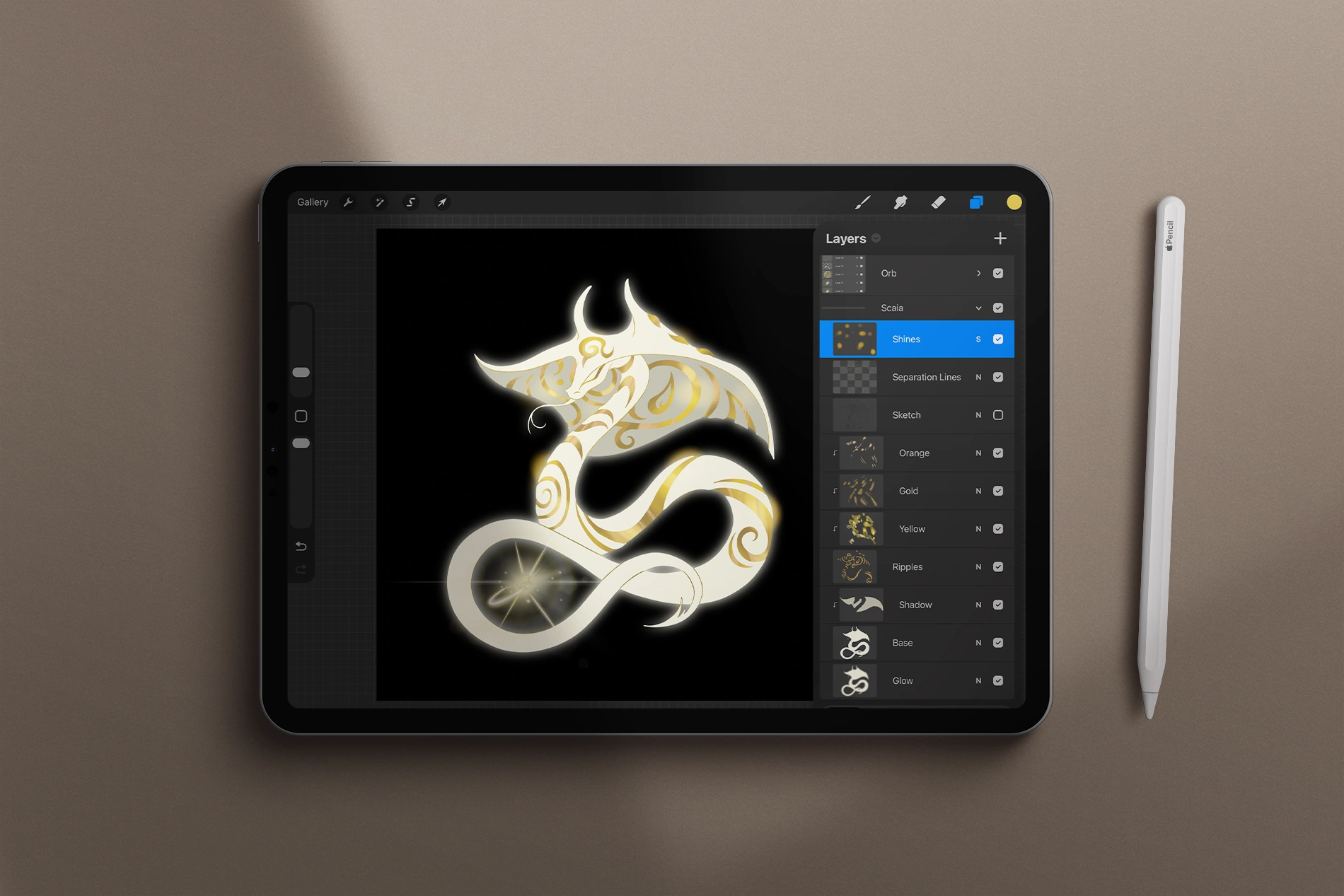
Screenshot of my procreate working file for a deity encountered in the campaign.
Style Explorations
This project was a love letter to the Zelda franchise, and I enjoyed creating art inspired by the visuals of the various Zelda games.
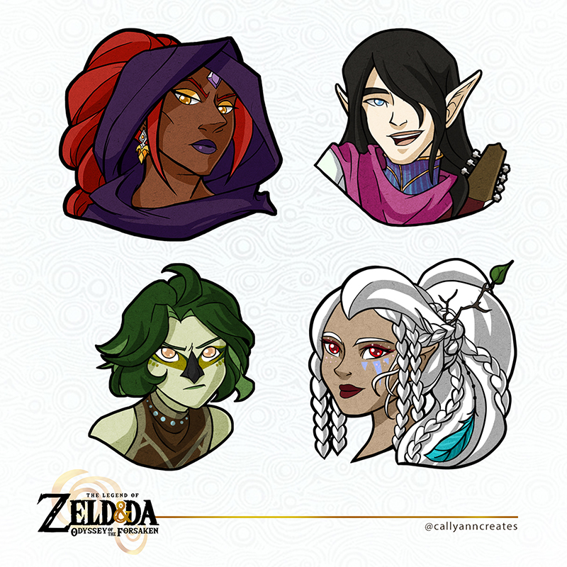
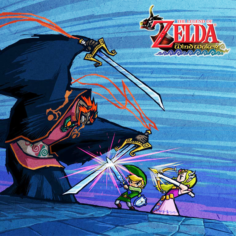
For the player tokens, I was inspired by the thick black line art, cel shading, and noise texture of the concept art from The Wind Waker. One: Player tokens by me. Two: Official concept art from The Wind Waker.
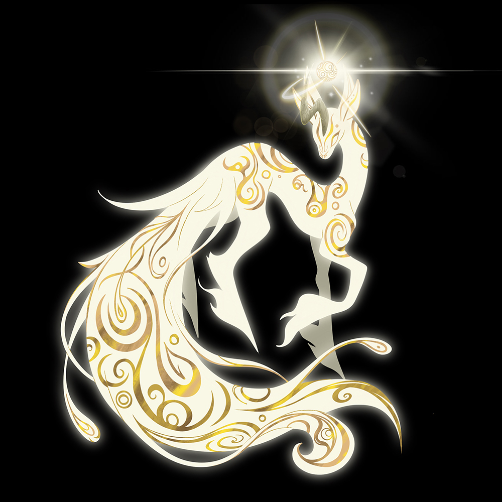
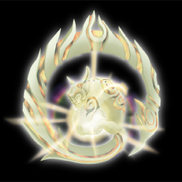
My campaign’s plot revolved around rescuing six light spirits, based on creatures of the same name from Twilight Princess. Rather than reuse the official designs from the game, I designed my own. One: Character design by me. Two: Official game art from Twilight Princess.
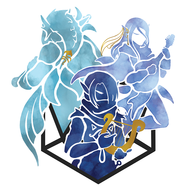
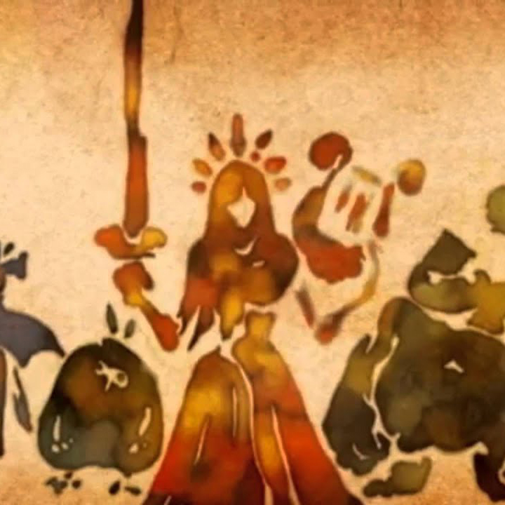
The cover illustration is based on the bleeding ink style displayed in the opening cinema of Skyward Sword. One: Odyssey of the Forsaken cover illustration by me. Two: Official game art from Skyward Sword.
Linktober
A large chunk of the illustrations and much of the text content featured in the book was born from a 31-day art challenge called "Linktober" in 2020. This challenge was inspired by Inktober, but instead of creating ink pieces, participants created fan art for the Legend of Zelda. I mixed and matched prompts from a few different Linktober prompt lists and used that as a narrative outline to plan what I would draw each day. My goal was to post an illustration and story excerpt to summarize the campaign to that point. At the time, I had a loose idea that I might eventually like to make an artbook for the campaign, but didn't have a firm plan in place. This challenge was the perfect motivator to get the concept rolling, as it pushed me to create at an intense pace.
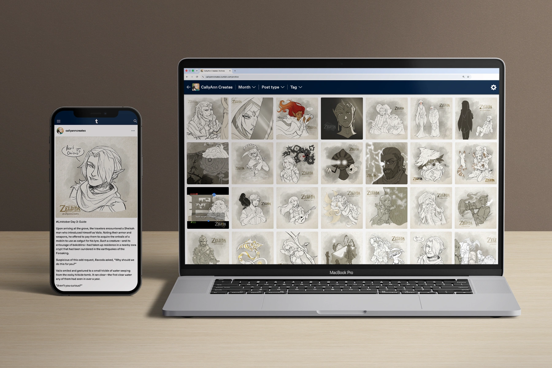
I shared all of my Linktober pieces to social media as I completed them. A few were featured on the official Linktober Instagram as the month progressed.
Collaboration
For a number of the final illustrations in the book, I collaborated with other artists.
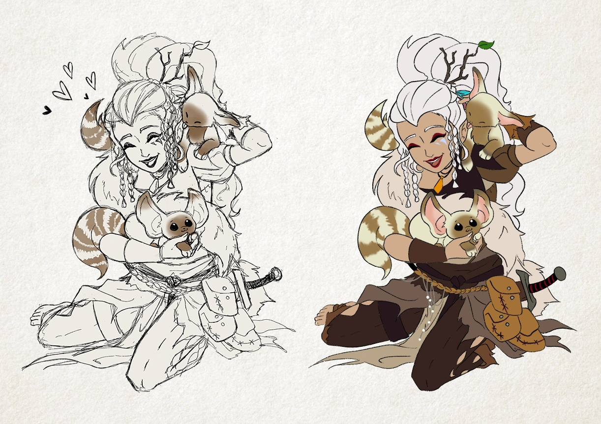
HallieKate Briggs supported the production of the book by providing inks and colors to some of my sketches. My original sketch is on the left, Hallie's finished piece is on the right.
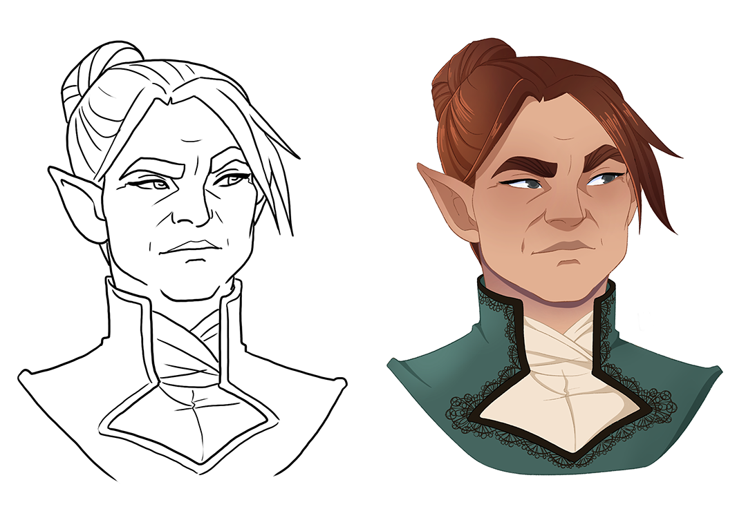
I have a long-standing commission relationship with character designer and illustrator Amy King. With her permission, I used sketches she's created for me as the basis for several painted portraits included in the book. Her original sketch of this NPC is shown on the left, and my version is on the right.
Layout
I created the layout for the book with a combination of Procreate, Photoshop, and InDesign. While much of the book’s design was built around existing art, there were several pieces I drew specifically for the book.
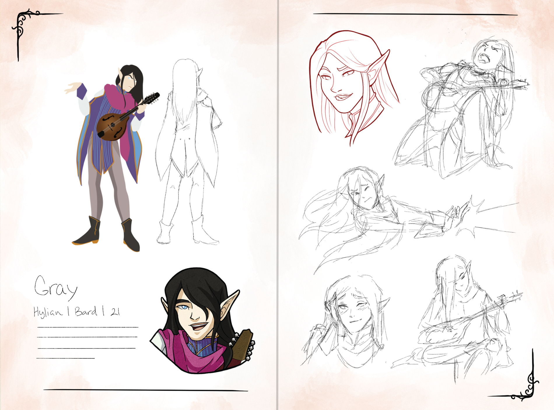
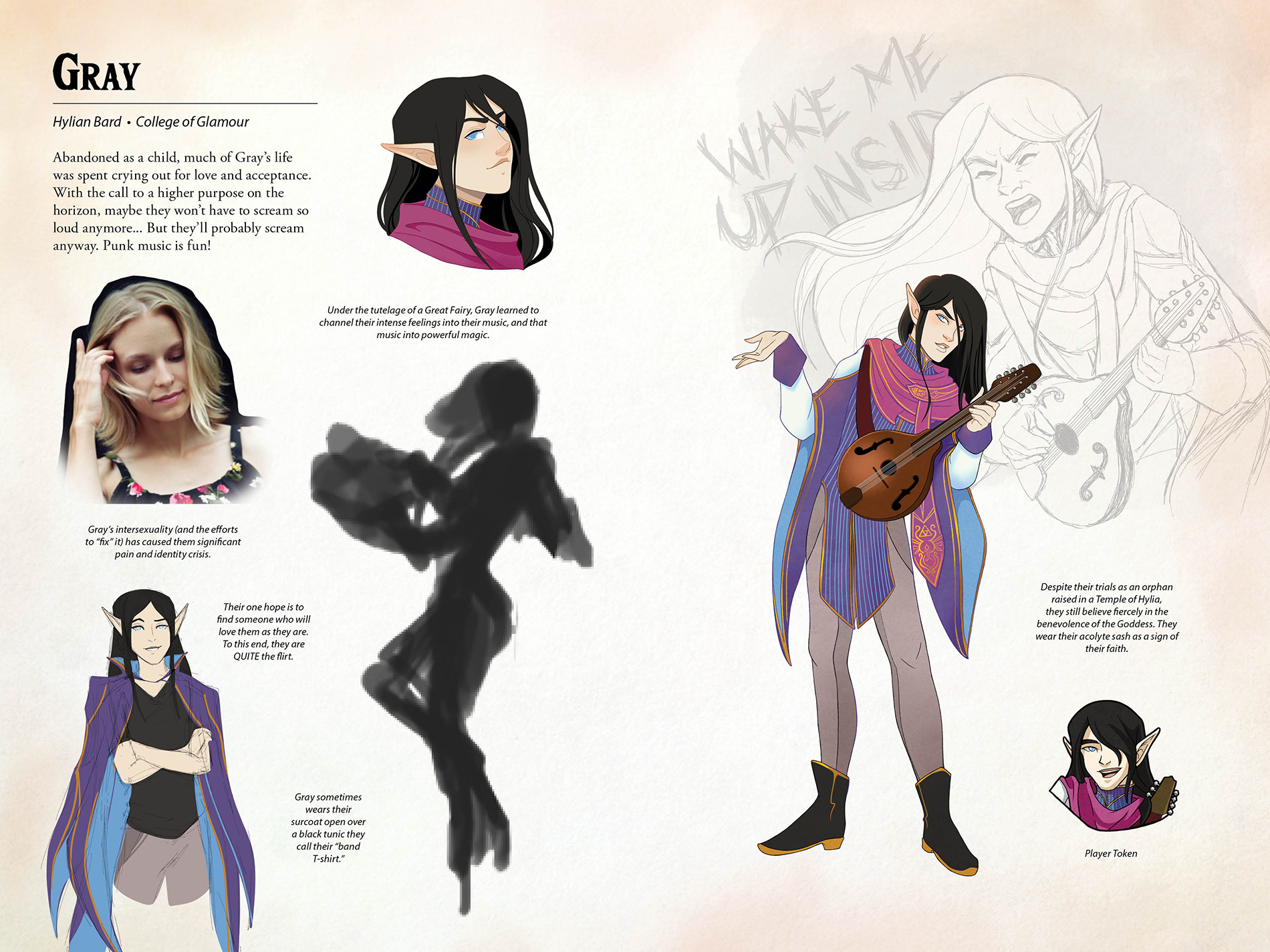
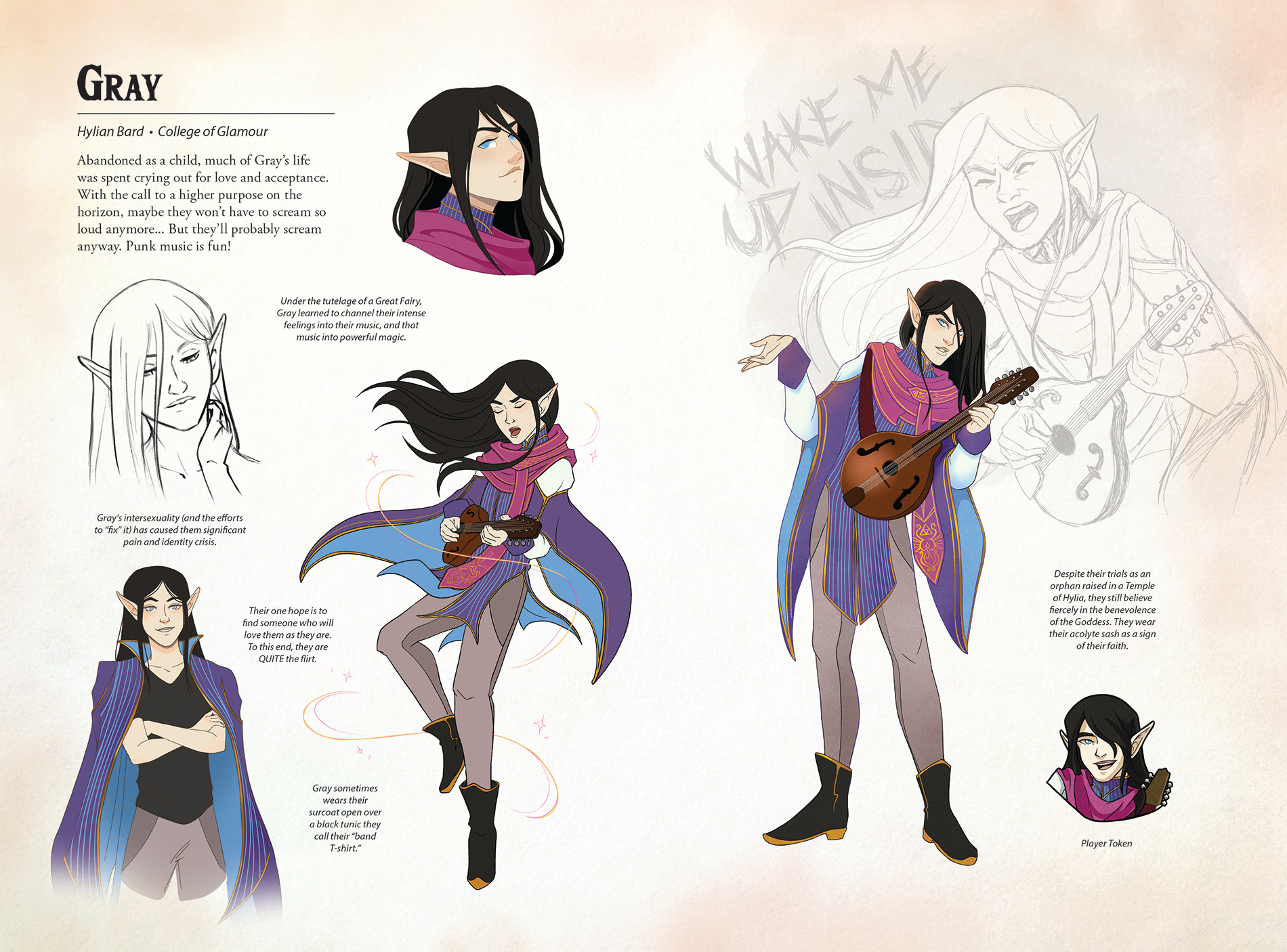
One: My first pass at a potential layout for the character spreads, using a combination of existing art and rough sketches for potential illustrations. Two: A later pass, with text and more finalized art. I used a photo reference and a very loose silhouette sketch to plan the illustrations that would fit in the remaining space. Three: The final spread.
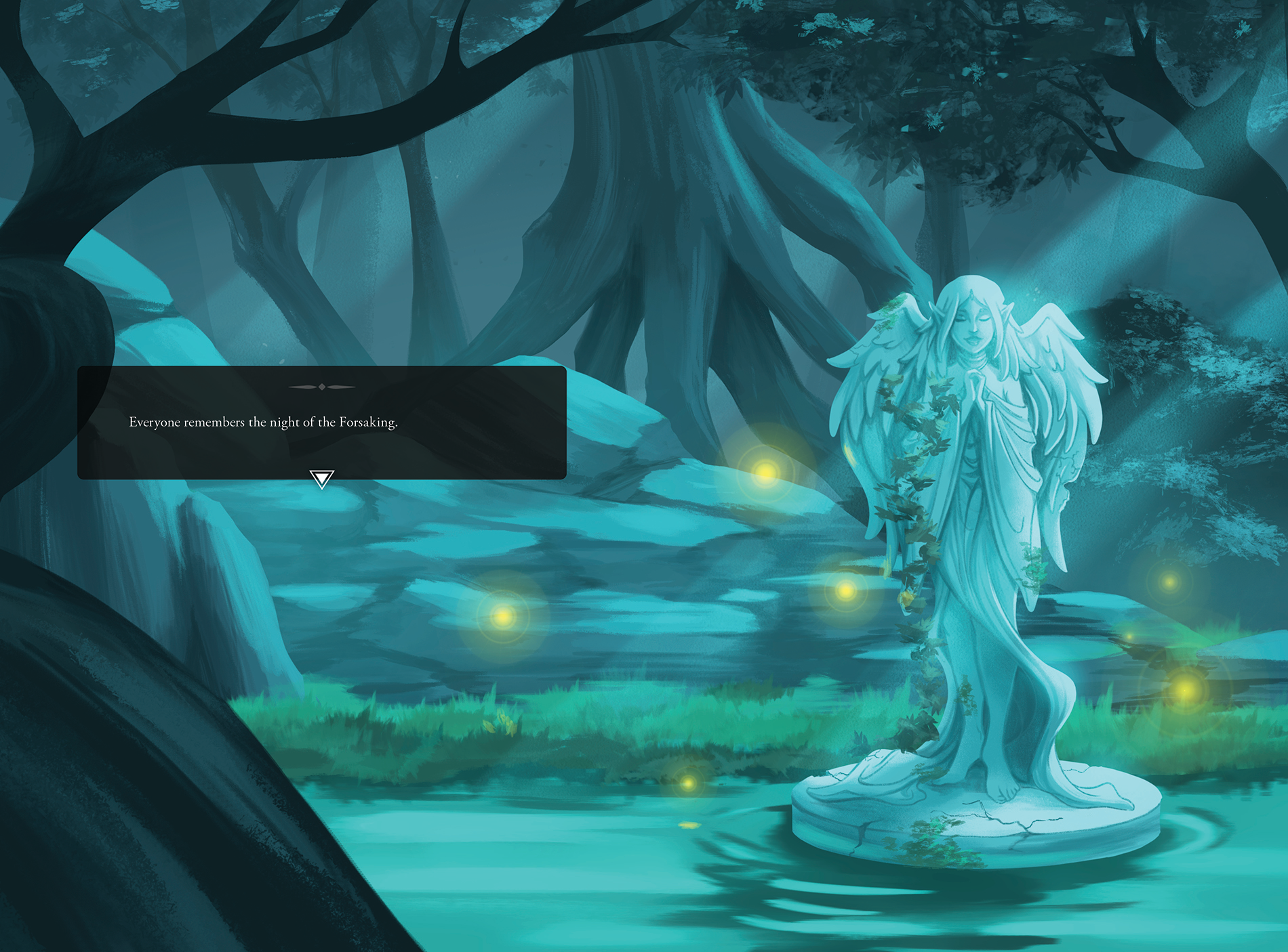
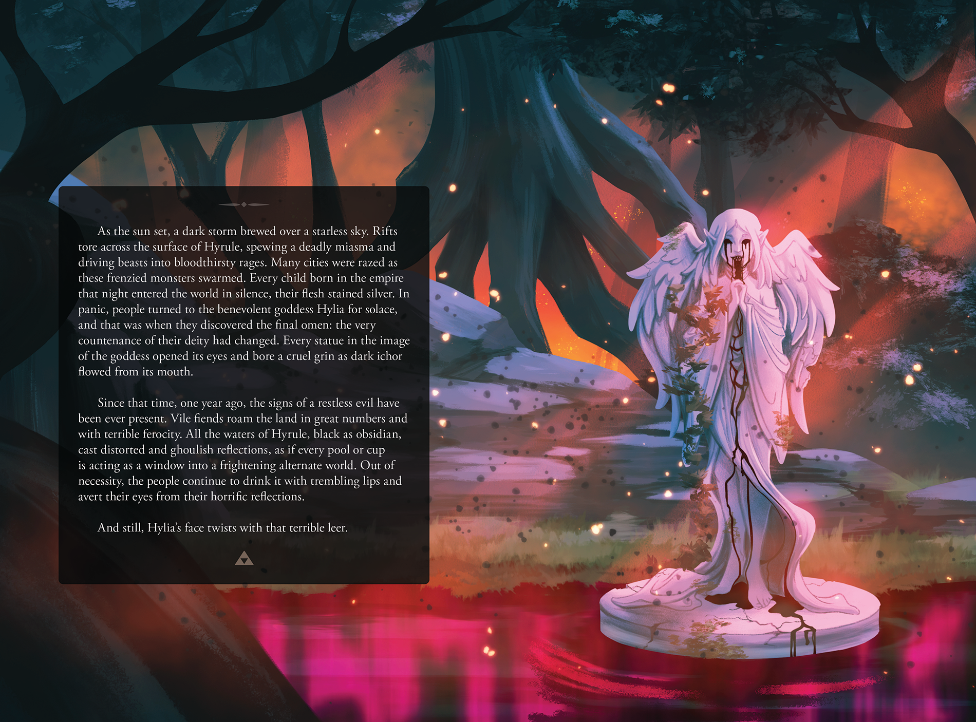
Two of my full-bleed spreads, showing the dire curse that served as the story’s inciting incident. I designed the black text boxes in these spreads to emulate the dialogue windows that appear in Breath of the Wild.
Promotion
I partnered with Ellis Printing to create a limited physical run of the book, and debuted it at FanX 2021. It was very well received; I sold almost every copy of that first run in three days.
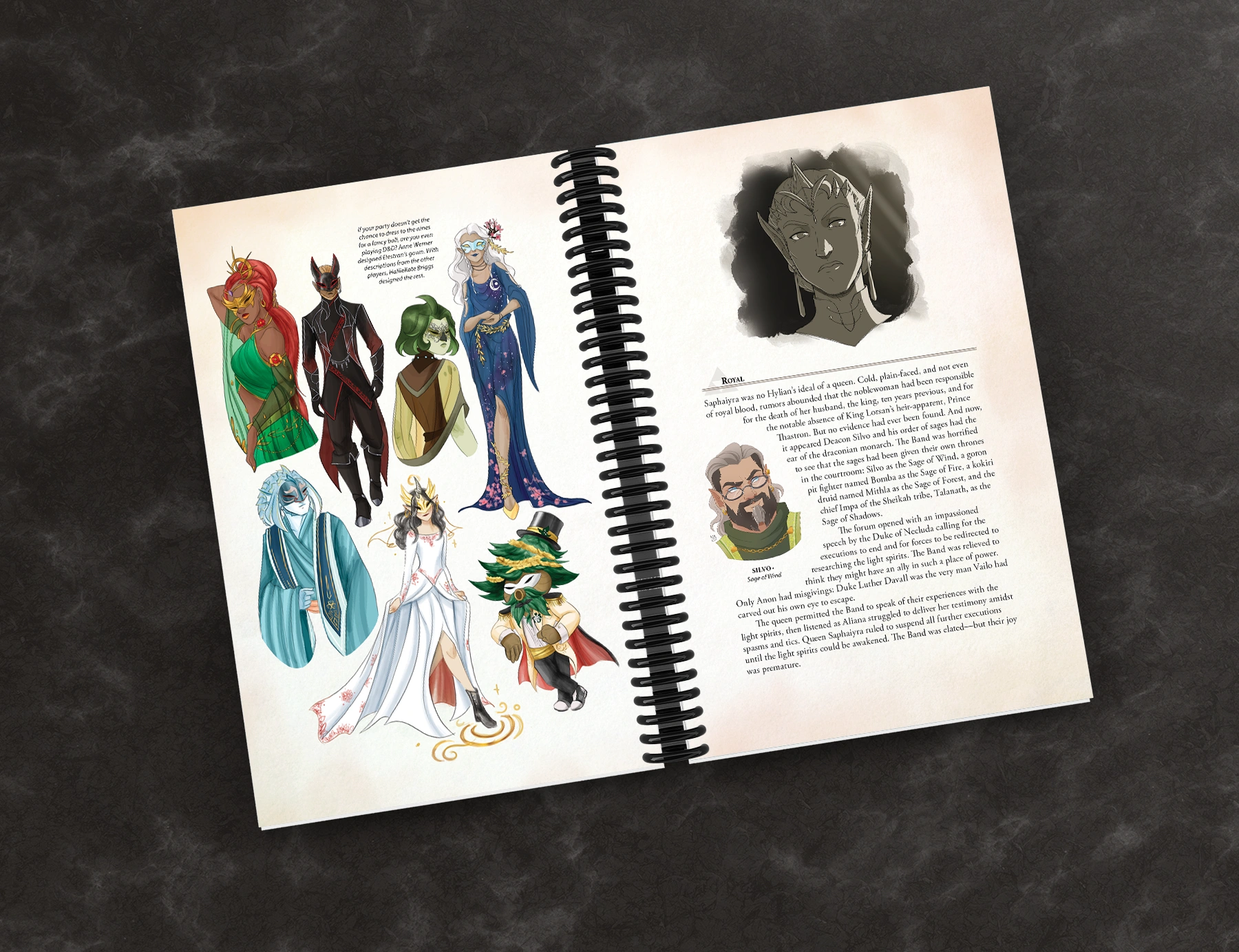
The official books were 6" x 9" perfect bound. I placed two spiral-bound versions on my booth table for display only; the spiral binding made the display copies easier for visitors to flip through. I was surprised by the number of buyers who mentioned wanting the spiral-bound version. An interesting bit of market research to consider for future art book projects!
A strategy I developed for hosting booths at conventions was to use one-sided business cards. Many visitors do a "first pass" through the Artist Alley and then come back later to make purchases. The blank back gave me space to write my booth number for that specific event, and I often would note down the pieces the visitor had expressed interest in so they would remember what they'd wanted to come back for. This massively improved my return rate for large, multi-day events. Visitors would come back after their "recon" tour through the event holding my business card with the booth number and personalized note, knowing right where to find me.
Since the art book was my headliner and a limited offering, I created a business card just for the project that visitors could take along with my regular business card.
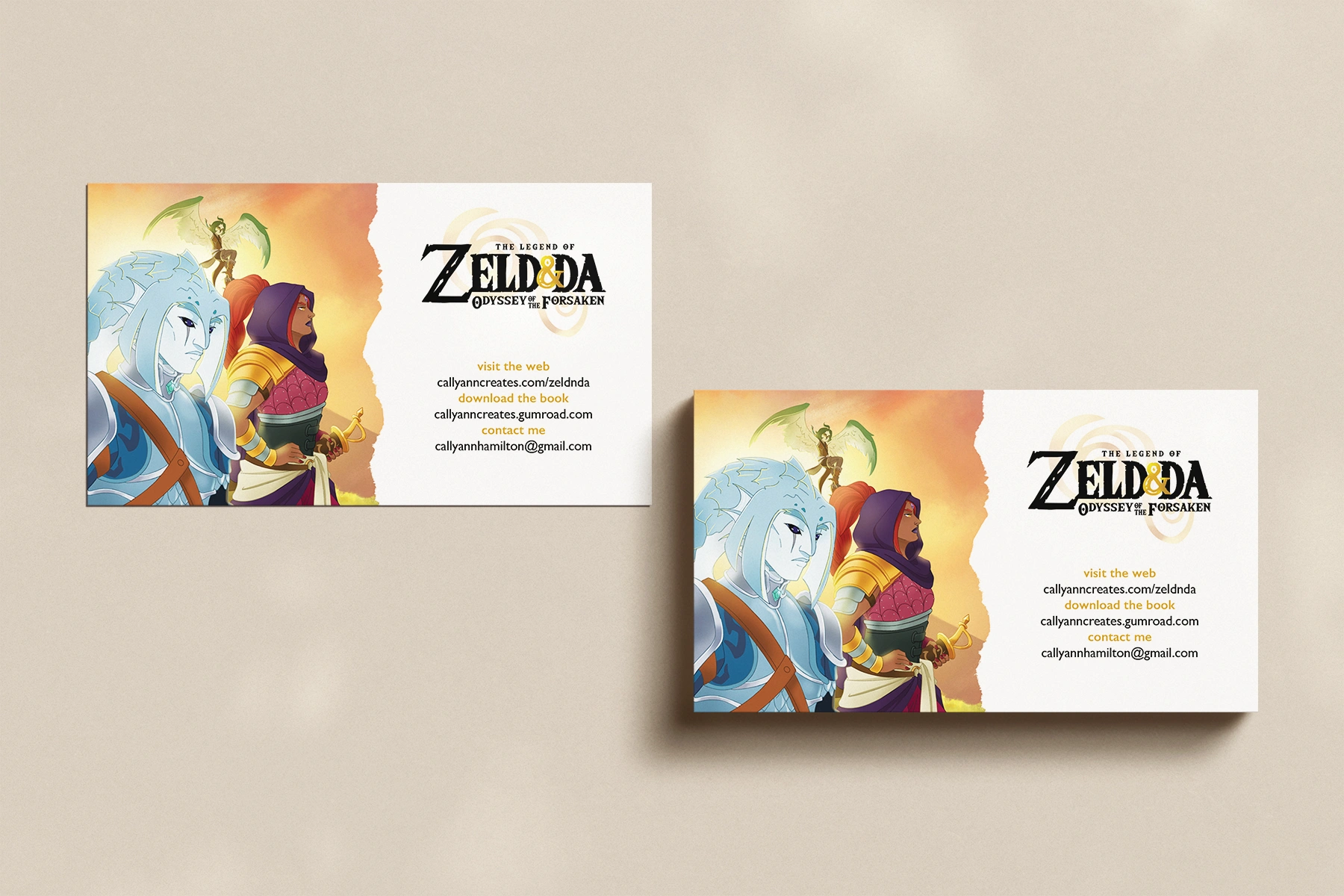
Odyssey of the Forsaken business cards.